
Precious Metal Insight
Get in Touch With Us
You Can Do This
Including precious metals in your investment portfolio can provide diversification, act as a hedge against market volatility, and preserve wealth over time. Gold, silver, platinum, and palladium each offer unique investment opportunities based on their properties and industrial demand.
Consider your risk tolerance, investment goals, and market trends when determining the appropriate
allocation of precious metals in your portfolio.
Ensure secure storage and consider insurance options to protect your valuable holdings.
By incorporating precious metals into your investment strategy, you can add stability, potential growth, and long-term value preservation.

Read Our Latest Thoughts
Lorem ipsum dolor sit amet, consectetur adipiscing elit.
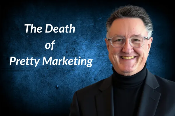
The Death Of “Pretty Marketing”
If your marketing is winning awards but losing sales… this is why.
Pretty doesn’t pay.
Proof pays.
And in 2026, “pretty” is getting exposed faster than ever—because buyers are tired, distracted, and skeptical. They don’t have time to decode your brand story. They don’t want clever. They want clear.
They want to know three things in about five seconds:
Do you solve my problem?
Can I trust you?
What do I do next?
If your website can’t answer those fast, you’re not “premium.”
You’re invisible.
What Pretty Marketing Really Is
Pretty marketing is when you optimize for applause instead of action.
It usually looks like this:
Big hero image. Small headline. No real offer.
Long “About” story. No hard proof.
Fancy animations. Slow load time.
Stock photos of smiling people. No real customers.
Vague promises like “Elevate your experience.”
CTAs like “Learn more” that lead nowhere.
It feels safe because it looks polished.
But polished is not persuasive.
Pretty marketing makes the owner feel good.
Proof marketing makes the phone ring.
Why Pretty Marketing Fails Now (More Than Ever)
Three reasons.
1) Attention is smaller than it used to be
Your buyer is not sitting at a desk sipping coffee.
They’re on a phone. At a stoplight. Between jobs. In bed at midnight.
They scroll fast. They decide fast.
If your message is not obvious, you lose.
2) Trust is lower than it used to be
Everyone has been burned.
Fake reviews. Fake claims. “We’re the best” with no receipts.
So buyers don’t “assume you’re good.”
They assume you’re like the last guy… until you prove otherwise.
3) Choices are endless
Your competitor is one tap away.
If your website is a “brochure,” you’re done.
You need a sales system, not a design project.
The Scoreboard: What Converts
Here’s what wins.
Not opinions. Not vibes. Not aesthetics.
Proof, clarity, speed, consistency, and reputation.
That’s the trust stack.
And the companies winning right now are the ones who use those five things like a hammer.
Before / After Example #1: The “Luxury” Website That Didn’t Sell
Before
A home services company came to us with a beautiful site.
It had:
Cinematic video header
Soft, poetic headlines
A clean menu
Minimal text
Lots of white space
“Premium” feel
It also had one major problem:
Nobody knew what to do next.
Their homepage said things like:
“Crafted solutions for modern living”
“Where quality meets comfort”
“Built for the way you live”
Sounds nice.
But it didn’t answer basic buyer questions:
What do you do?
What do you charge?
What areas do you serve?
Why should I trust you?
What happens after I fill out the form?
Result: traffic came in… and bounced.
After
We kept it clean. But we made it useful.
Changes we made:
1) New headline that says the service in plain English
Not clever. Clear.
Example: “Solar installed in 30 days. No surprises. Real warranties.”
2) Proof block above the fold
Right under the headline:
“1,200+ installs”
“4.8-star average”
“Local crews”
“25-year warranty options”
3) One primary CTA
Not five buttons. One next step.
“Get a price in 60 seconds.”
4) A “What happens next” section
Because fear kills conversions.
So we spelled out the process in 3 steps.
5) Real photos and real names
Not stock. Not models.
Crew photos. Truck photos. Jobsite photos. Owner story in one tight paragraph.
Result: conversions went up because confusion went down.
Pretty didn’t change.
Clarity did.
Before / After Example #2: The Award-Winning Ad That Bled Money
Before
A company ran an ad that looked like it belonged in a magazine.
Beautiful design.
Great lighting.
Short copy.
It said:
“Experience the difference.”
That’s not an offer.
That’s a slogan.
It got likes. It got compliments. It got shares.
It didn’t get buyers.
Because nobody wakes up wanting to “experience the difference.”
They wake up wanting to:
stop overpaying
fix the problem
avoid regret
make the right choice
protect their family
stop wasting time
After
We rebuilt the ad around one simple thing:
A specific promise + specific proof + specific next step.
New ad structure:
Hook:
“Still paying $300+ a month for power? Here’s why.”
Proof:
“Here’s what our last 10 homeowners saved in the first 90 days.”
Clarity:
“See your numbers before you buy anything.”
CTA:
“Get your savings estimate.”
We also added proof visuals:
screenshots of real bills (with names removed)
simple savings charts
short homeowner quotes
Not fancy.
Just believable.
Result: cost per lead dropped. Appointment rate rose. Sales calls got easier.
Because the ad did the heavy lifting up front.
Before / After Example #3: The “Brand Story” Homepage That Forgot the Buyer
Before
This one is common.
Homepage opens with:
“Welcome to our story.”
Then five paragraphs about values, mission, and passion.
Listen.
Values matter.
But when a buyer is in pain, they don’t care about your origin story.
They care about results.
After
We moved the story down.
Top of the page became:
what we do
who we help
what problem we solve
what it costs (or how pricing works)
why we’re safe to trust
what to do next
Then we added the story later as a trust builder, not a sales blocker.
Your story is seasoning.
Your offer is the meal.
What We Changed That Almost Always Increases Conversions
Here are the moves that win over and over.
Option 1: Proof Blocks That Hit Like a Hammer
Add proof in the first scroll:
reviews (real ones)
results (numbers)
logos (if legit)
before/after photos
certifications
years in business
guarantees
“as seen in” if true
Option 2: Stop Saying “Learn More”
Replace soft CTAs with clear CTAs:
“Get pricing”
“Book a call”
“See availability”
“Get my estimate”
“Send me options”
Option 3: Make the Page Answer Objections
Add sections like:
“How much does it cost?”
“What’s included?”
“Who is this NOT for?”
“What happens next?”
“Why are you different?”
Your buyer is already asking these questions.
If you don’t answer them, they leave and keep scrolling.
Option 4: Show the Process
Uncertainty is a conversion killer.
A simple 3-step process boosts trust fast:
You request info
We review + call you
You get a plan + next steps
Option 5: Use Real Images
Real photos beat stock photos.
Every time.
Even if they’re not perfect.
Because perfect feels fake.
And fake doesn’t convert.
The Rule: Beauty Supports Sales. It Can’t Replace It.
I’m not saying “ugly marketing” wins.
I’m saying empty marketing loses.
Design is a multiplier.
If your message is strong, design makes it stronger.
If your message is weak, design just makes weak look expensive.
So here’s the gut check:
If I remove your colors, your font, your logo, and your video…
Does your offer still sell?
If not, you don’t have a design problem.
You have a trust problem.
And trust is built with proof.
Not polish.

(678) 922-4561


